
Executive dashboards play a critical role in modern organizations. They translate complex business data into clear, actionable insights for leadership teams. However, many dashboards fail to deliver value not just because of lack of data, but due to poor design, misaligned metrics, or over-engineering.
This blog outlines the essential do’s and don’ts of building an effective executive dashboard, helping you create dashboards that drive faster decisions, strategic clarity, and measurable business impact.
What is a Business Dashboard?
A business dashboard is a management tool that presents data visualizations in a unified dashboard view. It displays business intelligence metrics, key performance indicators (KPIs), and critical information that reflects the performance of a business or specific departments. By using intuitive data visualizations, dashboards simplify complex datasets and provide users with an at-a-glance understanding of current performance and trends.
What is dashboard in business?
Most companies measure their performance and growth by analyzing data. However, recording, managing, and interpreting the vast amount of data generated across an enterprise can be complex and overwhelming for humans. Important insights may easily be missed. This is why many businesses rely on dashboards as a business intelligence tool to present data in a clear, structured, and easy-to-understand format.
Dashboard analytics has become an essential part of modern business operations, supporting data-driven processes and decision-making. Dashboards play a vital role in organizations, and some of the key advantages of using business dashboards are outlined below:
Data Transparency:
Data is one of a company’s most valuable assets. When properly accessed and understood, it can drive organizational growth and improvement. A well-designed dashboard provides on-demand visibility into critical metrics, ensuring transparency across the business.
Centralized Access to Data:
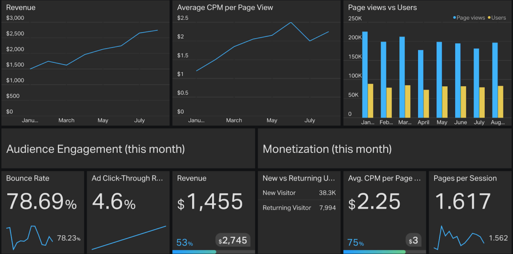
Organizations generate data from multiple sources such as sales, production, manufacturing, and operations. Dashboards consolidate this data into a single view, enabling users to monitor performance immediately. For example, a Sales Performance Report within the dashboard allows teams to track revenue, targets, and trends immediately. Best practices include maintaining clean data and designing dashboards tailored to specific departments or business functions.
Better Decision-Making:
Dashboards offer an unbiased, real-time view of overall business performance as well as departmental insights. When departments have access to shared dashboards, it encourages collaboration, alignment, and more informed decision-making.
Interactive and Dynamic Insights:
Modern business intelligence dashboards often provide real-time and interactive experiences. Dynamic dashboards allow users to filter data, explore trends over time, interact with visualizations, and perform ad-hoc analysis. This flexibility enables users to view both high-level summaries and detailed insights based on their needs.
What Is an Executive Dashboard?
An executive dashboard is a high-level, visual reporting interface that presents key performance indicators (KPIs) and strategic metrics aligned with an organization’s business goals. Unlike operational dashboards, which focus on detailed, transaction-level data, executive dashboards emphasize outcomes, trends, and exceptions, enabling leaders to quickly assess overall business performance.
The primary purpose of an executive dashboard is to:
- Enable quick and clear understanding of business performance
- Support strategic and data-driven decision-making
- Provide a single, reliable source of truth for leadership
At its core, an executive dashboard is a computer-based reporting tool that visually represents organizational performance across business units, functions, and projects. It offers executives a consolidated, at-a-glance view of critical information, helping them monitor progress, identify risks, and uncover opportunities without diving into operational complexity.
An effective executive dashboard delivers actionable insights and can be customized to meet specific leadership requirements. Executives should have the flexibility to select and track KPIs that align with the organization’s strategic objectives. To remain relevant in fast-changing business environments, dashboards must be dynamic, allowing users to adjust views, preferences, and metrics based on evolving priorities.
Modern executive dashboards are designed to:
- Extract real-time or near-real-time data from multiple internal systems
- Provide built-in analytics capabilities
- Enable drill-down functionality to explore highlighted metrics in greater depth
This combination empowers executives to move seamlessly from high-level insights to detailed analysis when needed.
Key Features of an Effective Executive Dashboard
- Visually appealing and intuitive design that is easy to navigate
- Clear performance tracking against plans, targets, and benchmarks
- Faster and more informed decision-making
- Improved internal communication and alignment across teams
- Time savings through instant access to critical insights
- Enhanced external communication through data-backed reporting
- Improved employee performance through transparent goals and accountability
- Increased profitability by identifying trends, risks, and growth opportunities early
What needs to be done to build an effective executive dashboard?
The Business Intelligence (BI) Executive Dashboard has become a permanent and essential solution for delivering in-depth insights to organizations. As data continues to be generated and multiplied across enterprises, there is a growing need to process, analyze, and interpret this data using tools that are both powerful and easy to use.
An effective executive dashboard should seamlessly integrate data visualization, data analysis, performance metrics, and key performance indicators (KPIs). These elements help transform raw data into meaningful insights that support strategic decision-making. Executive dashboards can be designed in different formats, each serving a specific business purpose. For example, a profit margin analysis dashboard provides a quick and clear summary of an organization’s profitability.
Today, executive dashboards have become powerful decision-support tools for senior leadership and company management. They offer a consolidated, single-view snapshot of the organization’s performance, enabling executives to monitor key areas without navigating multiple reports. Additionally, dashboards should allow users to customize views, apply filters, and adjust metrics in line with evolving strategic business plans.
The goal of building an executive dashboard is to maximize business value by implementing relevant, well-defined KPIs that align with organizational objectives. When designed thoughtfully, an executive dashboard empowers leaders with timely, accurate, and actionable insights to drive smarter decisions and sustainable growth.
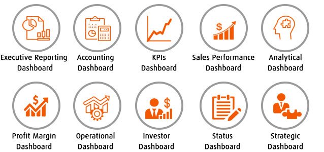
What are the types of Executive Dashboard?
Dashboard Design Principles
Designing an effective dashboard goes beyond selecting charts and visual elements. It requires a thoughtful approach that balances clarity, usability, and business relevance. A well-designed dashboard transforms complex data into meaningful insights, enabling decision-makers to quickly understand performance, identify trends, and take timely action. By following proven dashboard design principles, organizations can ensure their dashboards are intuitive, focused, and aligned with strategic objectives. The following principles outline the key considerations for building dashboards that deliver real business value.
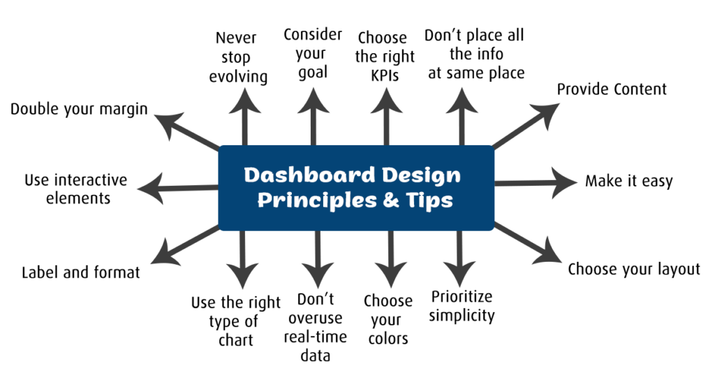
- Clarity Over Complexity
A dashboard should communicate insights instantly. Avoid unnecessary visuals, excessive colors, or crowded layouts. Each chart and metric should have a clear purpose, enabling users to understand performance briefly without confusion.
- Focus on Key Metrics
Dashboards should highlight only the most critical KPIs aligned with business goals. Including too many metrics dilutes attention and reduces impact. A focused set of indicators ensures decision-makers concentrate on what truly matters.
- Consistent and Intuitive Layout
Consistency in design helps users quickly interpret data. Use standardized colors, fonts, labels, and chart types across the dashboard. Place the most important metrics at the top or in prominent positions to guide user attention naturally.
- Provide Context and Comparisons
Metrics are more meaningful when shown in context. Include trends, targets, benchmarks, or period-over-period comparisons so users can easily understand performance changes and take informed action.
- Interactivity and Usability
An effective dashboard allows users to interact with data through filters, drill-downs, and dynamic views. Interactivity enables both high-level overviews and deeper analysis, empowering users to explore insights based on their needs.
Important Do’s and Don’ts of building Executive Dashboard
DO: Keep the Dashboard as Simple as Possible
Strive to keep your executive dashboard simple it not only in design, but also in data collection and reporting. Simplicity improves clarity and usability, allowing executives to understand insights quickly. Keeping a dashboard simple does not mean removing important information; it means presenting key insights in a clear and focused manner.
DO: Identify Metrics That Are Most Predictive of Success
Analyze which KPIs and metrics best reflect business performance and strategic success. KPIs should be planned and defined before building the dashboard. Carefully selecting the right measures ensures the dashboard provides meaningful insights into progress toward business goals.
DON’T: Place All Information on a Single Page
Avoid overcrowding the dashboard with too much information on one screen. Consider your audience and their specific needs when presenting data. For example, a sales manager may require different insights than a marketing leader. If it is necessary to include multiple views, use tabs or sections to organize information by subject, making it easier for users to find what they need.
DON’T: Use Too Many Colors
Color selection plays a crucial role in dashboard effectiveness. Limit your palette to two or three complementary colors and use gradients thoughtfully. Align colors with your brand identity, such as theme colors, logos, and fonts. Overusing highly saturated or inconsistent colors can distract users and reduce clarity.
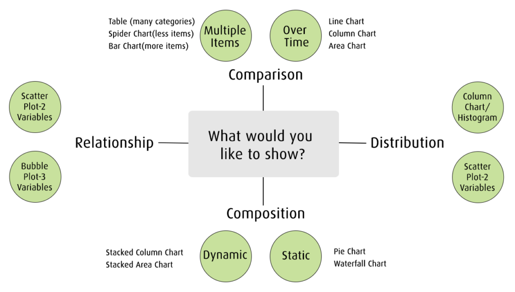
DON’T: Rely on the Same Chart Type for All Data
Avoid repeatedly using the same chart type for different datasets. Choosing the wrong visualization can misrepresent insights and reduce impact. Select chart types based on the message you want to convey:
- Bar charts for comparisons
- Line charts for trends over time
- Scatter plots for relationships and distributions
- Pie charts only for simple compositions—not for comparisons or distributions
Using the right visualization ensures data is communicated clearly and effectively.
Relevant KPIs and metrics for Executive Dashboard
Below are the key performance indicators commonly used in an executive dashboard to provide a clear, high-level view of business performance.
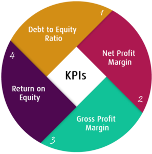
Debt to Equity Ratio:
Measures financial leverage by comparing total liabilities to shareholder equity, indicating long-term solvency and risk.
Net Profit Margin:
Shows percentage of revenue remaining as profit after all expenses, reflecting overall business profitability efficiency.
Gross Profit Margin:
Indicates how efficiently a company produces goods by comparing gross profit to total revenue.
Return on Equity (ROE):
Measures how effectively a company uses shareholder investments to generate net profit and value.
Conclusion
Building an effective executive dashboard is less about the tools used and more about clarity, alignment, and trust. By following the right do’s and avoiding common don’ts, organizations can transform dashboards from passive reports into powerful decision-making assets.
When designed correctly, an executive dashboard does not just show performance it shapes strategy and drives action.
If you are looking to experience how a well-designed executive dashboard can deliver real-time, actionable insights, explore the EzDataMunch free trial and see it in action.
FAQ’s
What is the primary purpose of an executive dashboard?
An executive dashboard provides a high-level view of key business metrics, enabling leaders to monitor performance and make strategic decisions quickly.
How many KPIs should an executive dashboard include?
An effective executive dashboard typically includes 8–12 critical KPIs focused on strategic goals rather than operational details.
Should executive dashboards use real-time data?
Yes, where possible. Real-time or near-real-time data helps executives respond quickly to risks, opportunities, and changing business conditions.
How often should an executive dashboard be updated or reviewed?
Dashboards should be reviewed regularly monthly or quarterly to ensure KPIs remain aligned with evolving business objectives.

Anupama Desai
President & CEO
Anupama has more than 23 years of experience as business leader and as an advocate for improving the life of the business users. Anupama has been very active in bringing business perspective in the technology enabled world. Her passion is to leverage information and data insights for better business performance by empowering people within the organization. Currently, Anupama leads Winnovation to build world class Business Intelligence application platform, and her aim is to provide data insights to each and every person within an organization at lowest possible cost.